Which mockup template for which job? A guide to the templates
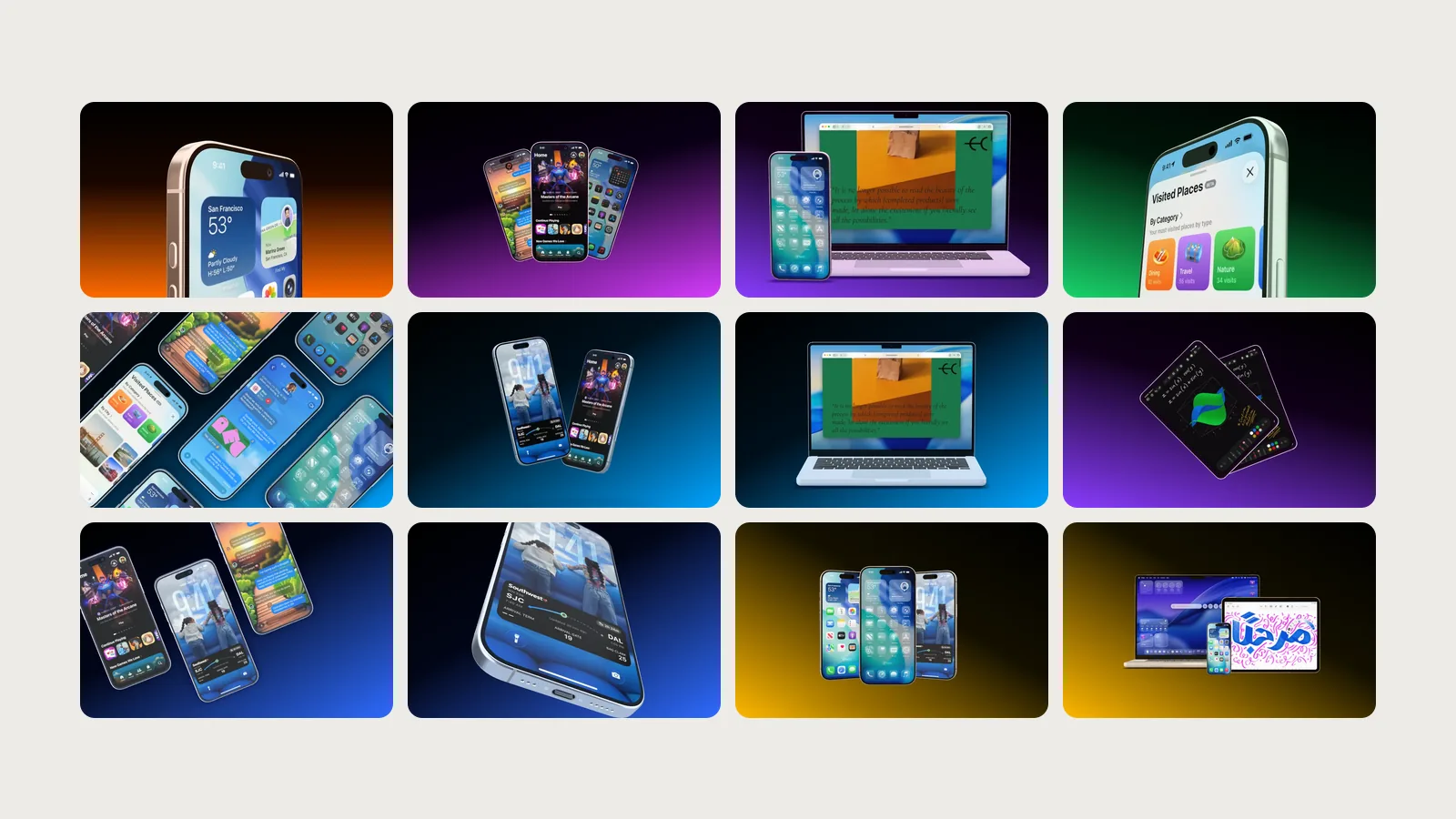
A template in Showoff is a finished scene with devices, camera and background. You open it in the editor, swap in your screenshot and export. The hardest decision is often the first one, which template fits. Here they are, sorted by what you need them for.
The first image on the App Store
The first image decides whether someone keeps reading. A single phone, big and bold, carries it best.
- Low Hero shows an iPhone from just below, so close that the frame crops it.
- Steep Hero tips it steeply toward the camera, and the screen still stays readable.
- Float is the calm all-rounder, a floating iPhone at a relaxed tilt.
- Three Quarter shows the edge of the device and looks like a product photo.
Several screens at once
For an overview of your features or a whole set for the store.
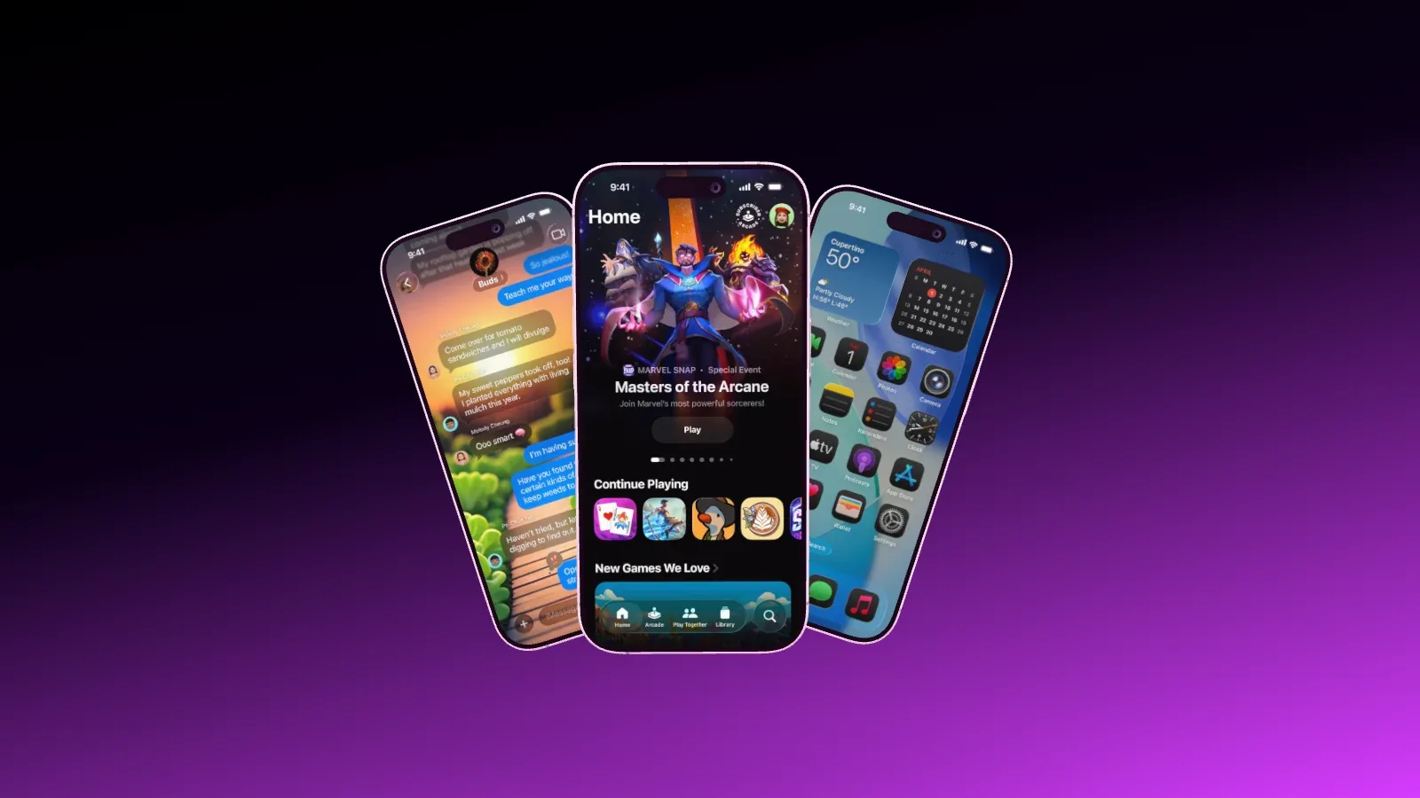
- Fan Trio fans out three iPhones from the center, the middle one in front.
- Fan Deck shows four iPhones like a hand of cards.
- Stagger lines up three facing the camera, the middle one a step forward.
- Mosaic lays seven iPhones in a diagonal grid, enough for a whole flow.
Two screens that belong together
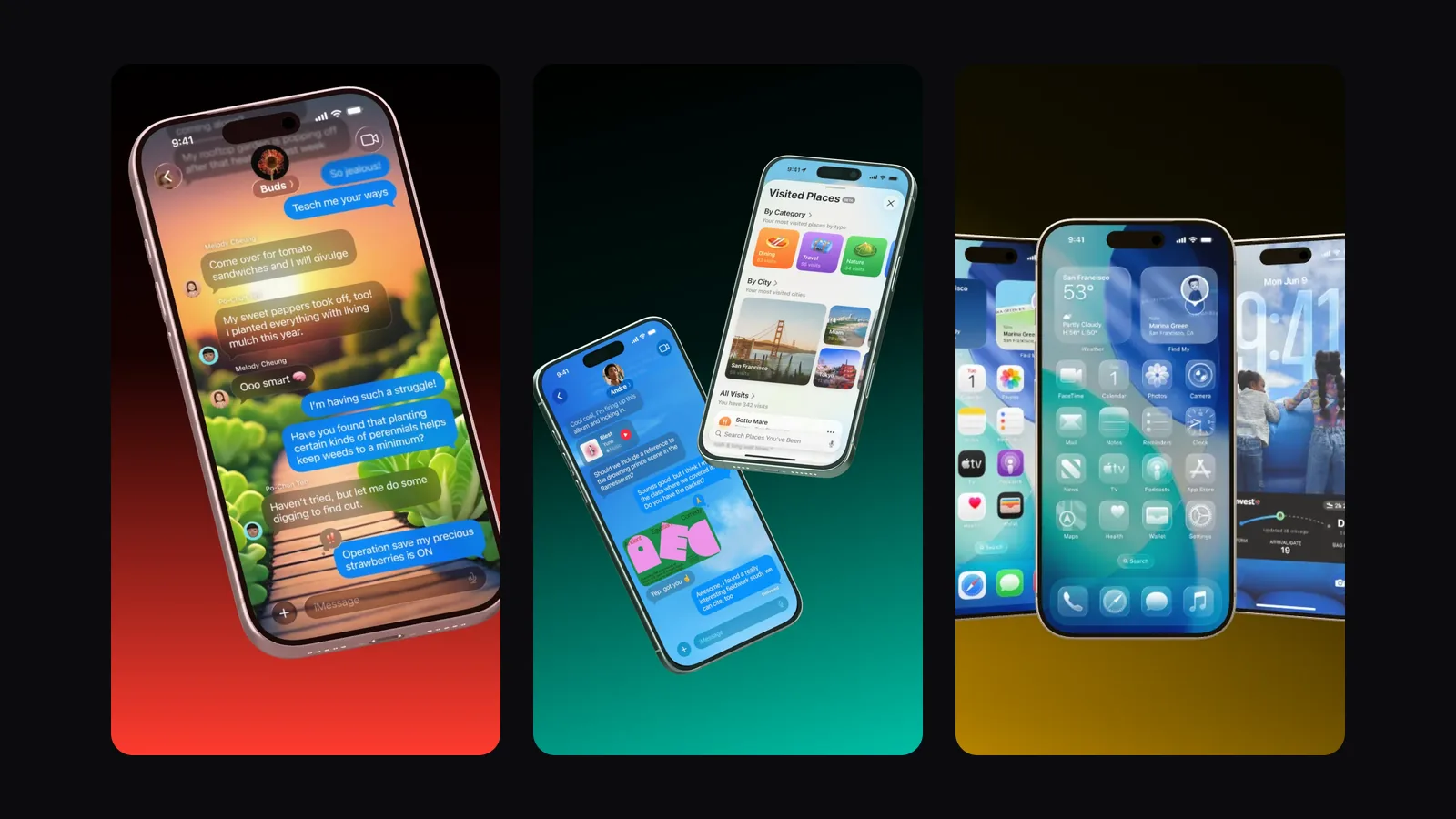
- Mirror places two iPhones side by side as mirror images, good for a before and after.
- Lean In lets two iPhones lean toward each other.
- Tilt Duo pairs a main screenshot with a second one that backs it up.
- Tall Cross crosses two in portrait, made for Stories and Reels.
Websites, web apps and every platform
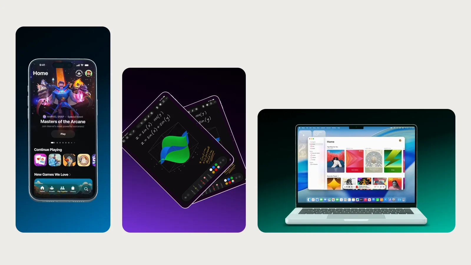
- Open Lid shows a MacBook straight on, and the screen gets all the attention.
- Top Down shows it from above on the desk, for dashboards and SaaS.
- Desk Duo puts an iPhone in front of the MacBook, for a web app and an app together.
- Ecosystem shows a MacBook, an iPad and an iPhone together, for a product that runs everywhere.
Apps for the iPad
- Tablet Fan fans out two iPads, for apps that need the big screen.
- Layered layers the phone and tablet versions of your app into one hero image.
One detail up close
- Corner Macro zooms in on the top corner with the Dynamic Island.
- Edge Crop crops an iPhone at the bottom, and the crop makes the screen feel big.
- Wide Close goes so close with a wide angle that the screen fills the frame.
- Push In moves in on an iPhone lying flat in a video and draws the eye to one spot on the screen.
Calm images for blogs and slides
- Flat Trio and Flat Duo lay iPhones flat on the table.
- Flat Pair lays an iPad and an iPhone side by side.
- Straight On shows an iPhone straight on, the neutral choice for documentation.
Videos for your launch
- Scan & Spin travels over the screen, then the phone spins around once.
- Roll In rolls two iPhones into the frame one after the other.
- Cascade springs three iPhones into place and lets them fly out again.
- Desk Reveal opens a MacBook, then an iPhone flies in next to it.
You export animations as MP4 or WebM. The whole range is in the animated templates. If you need a film cut to your song, have a look at the launch video.
A template is a starting point
You don’t have to take any template as it is. In the editor you swap the device, say an iPhone for a Pixel, without rebuilding the scene. You set the angle, background and text freely, and in the “Bühne” (stage) tab you choose another format. The template itself stays untouched, because a click on “Open template” creates a copy as a new project.
Every template page names its format, its devices and, for animations, the length. Low Hero, for example, is 2000 × 2000 pixels, and Tall Cross is a portrait format. Every template is part of Free too.
How to find yours
Ask yourself three things. How many screens do you want to show, where will the image appear, and should it move? One screen needs a single device, three features need a fan, and a Reel needs portrait or an animation. The templates overview filters by iPhone, iPad, MacBook, several devices, close-ups, flat lays and animations.
You open any template in the editor with one click, and there you only swap the screenshot. If you work with an AI, every template page has a ready sentence for it that you just copy. The glossary explains the layout names, and App Store screenshot sizes 2026 helps with the store sizes.